Book plates
 Offering an original illustration inside a book — as part of an Artist Edition — is a tremendous way to drive sales and/or Kickstarter pledges.
But… have you ever tried to do a decent drawing on the inside cover (or an inside page) of a book? It’s not easy. And — depending on the coating you used on your cover/pages — the ink doesn’t always take to the surface very well.
There’s got to be a better way…
The Artist-Edition Page
I built in a special Artist Edition page into a couple of my graphic novels. This was a page, labeled appropriately, that had a big white space for me to draw in. Not only did that make it easier to process the Artist Editions, but it encouraged people who had already bought the book to bring it to a convention appearance so I could sketch inside it (and sell them another book).
But there are a couple of drawbacks to that approach. First, if you. like me, are scaling back significantly on convention appearances, it has dubious use. Second, it’s only functional for the small percentage of buyers who got the Artist Edition or who pursued you at a con. for everybody else, it’s a big, fat, blank page. Finally, when you’re paying for an offset-print run, your total number of pages must be a factor of four. My chain of Artist Edition pages ended the minute I was faced with paying for three extra pages in order to get the one page I needed. After that, it seemed silly to start it up again.
However, that didn’t solve my other complaint — drawing a decent illo inside a book is just… hard. It’s not the best conditions under which to work.

Book plates
I’ve never been a fan of book plates. I’ve always been a bit of a purist. I felt as if the illustration had to be done directly on the inside cover — or a blank inside page — of the book itself. But facing down a list of nearly 100 Artist Editions cured me of that. If I waited until the books arrived to start the illos, those backers were going to get their books much later than backers who had spent much less.
That’s not a good way to reward generous backers. (Even though, in my experience, the backers who complain the loudest are almost always the ones that spend the least.)
So, I had to face down my prejudice. After all, the Artist Edition book is simply an extension of an autographed book. It’s a way of owning something that had a special connection to the author. Why was a drawn-in illo better? Was it the permanence — the fact that the illustration was indelible? And, if so, wasn’t a bookplate that had been glued into the book almost as permanent as the ink? Certainly, one could try to peel the plate off the page — but it wouldn’t end well — and the only likely outcome would be to decrease the value of the book itself. It would be the same if someone scribbled out the autograph.
High end approach
As with many things, there’s a high-end and a do-it-yourself approach to book plates. Many cartoonists I know endorse Book Plate Ink. This company prints personalized book plates on high-quality, acid-free, self-adhesive* paper.
From their pricing page, their typical turnaround time is three weeks. You can order rush delivery for an extra $25:
Our bookplates are typically 4 inches high and 3 inches wide, printed on self-adhesive paper* with a peel-off backing, and custom imprinted with your name or the text of your choice. Our paper, adhesive backing and ink are archival quality and acid-free. Bookplates from the black and white gallery are printed on a cream-colored paper unless requested otherwise. Color designs are printed on white stock. Other sizes are available upon request.
*That’s a fancy word for “sticker.”
The unit price starts at about $2 per sticker for an order of 50, and the unit price drops as low as 28¢ for an order of a thousand.
Do It Yourself
If you’re not as concerned about using acid-free paper, buy a package of printable mailing labels, print a design on them, and get drawing. You can get different sizes, print them to your own specifications, and reduce the cost to pennies.
Design
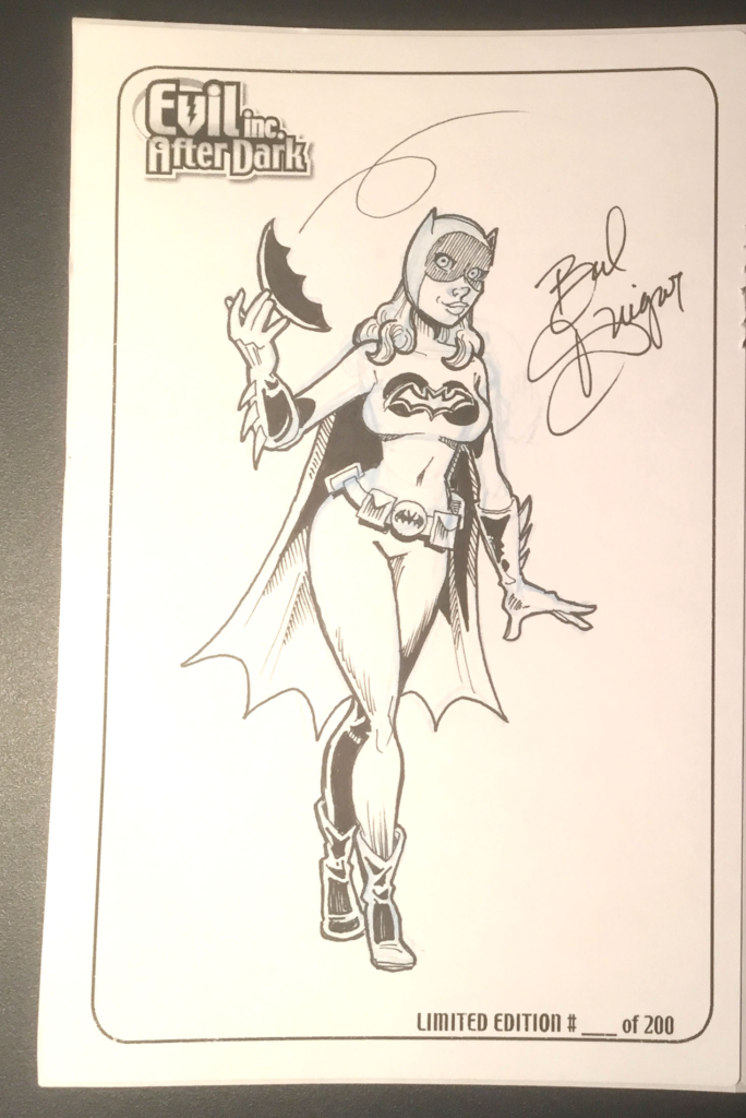
No matter which path you take, consider the following elements as you design your book plate. First, it should have a frame or border of some sort. To my eye, it’s a more professional aesthetic — even if it’s simply a basic line. If you neglect this, your illustration might look as if it’s just… floating… on the page. And that might not be the best presentation. Secondly, it would be great to include a little branding. This could be the logo for your comic and/or your own name. Finally — and most importantly — if this is part of a limited edition, include the following notation: Limited edition # ______ of 250. Of course, substitute for 250 the actual number of editions in your limited run. You will fill in the blank — in ink — when you complete the illo.


Recent comments