Maximize Revenue with Ad Placement Hot Spots
You don’t need a subscription to read today’s post!
This is a re-post from the Webcomics.com archive. If you’ve ever been curious about the kind of information, tutorials and advice that you’ll get as part of your subscription to Webcomics.com, this is a good example.
If you’d like to join the site, you can get a 12-month subscription for $30 — or you can get a one-month Trial for $5 … with no obligation after your 30 days expire. For less than three bucks a month, you can get a steady flow of information, tutorials and advice targeted towards your webcomic business — plus a private forum to discuss issues with other professionally minded cartoonists.
 When I was forced to change Content Management Systems recently, I had the opportunity to give my existing Web design a couple of tweaks. And one of the most important ones was ad placement.
Ad placement is one of the primary factors in making more money from your advertising. After all, advertisers are paying for exposure, and if you’re not giving them that, you’re missing out.
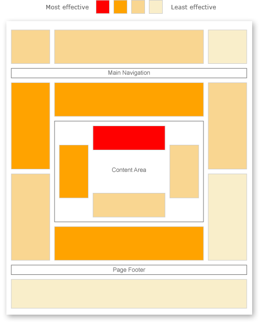
Google has a much-passed-around “heat map” of site content (as seen on the right). This is based off research that they’ve done through AdSense to determine which placements of ads deliver the best user response.
Putting Hot Spots into action
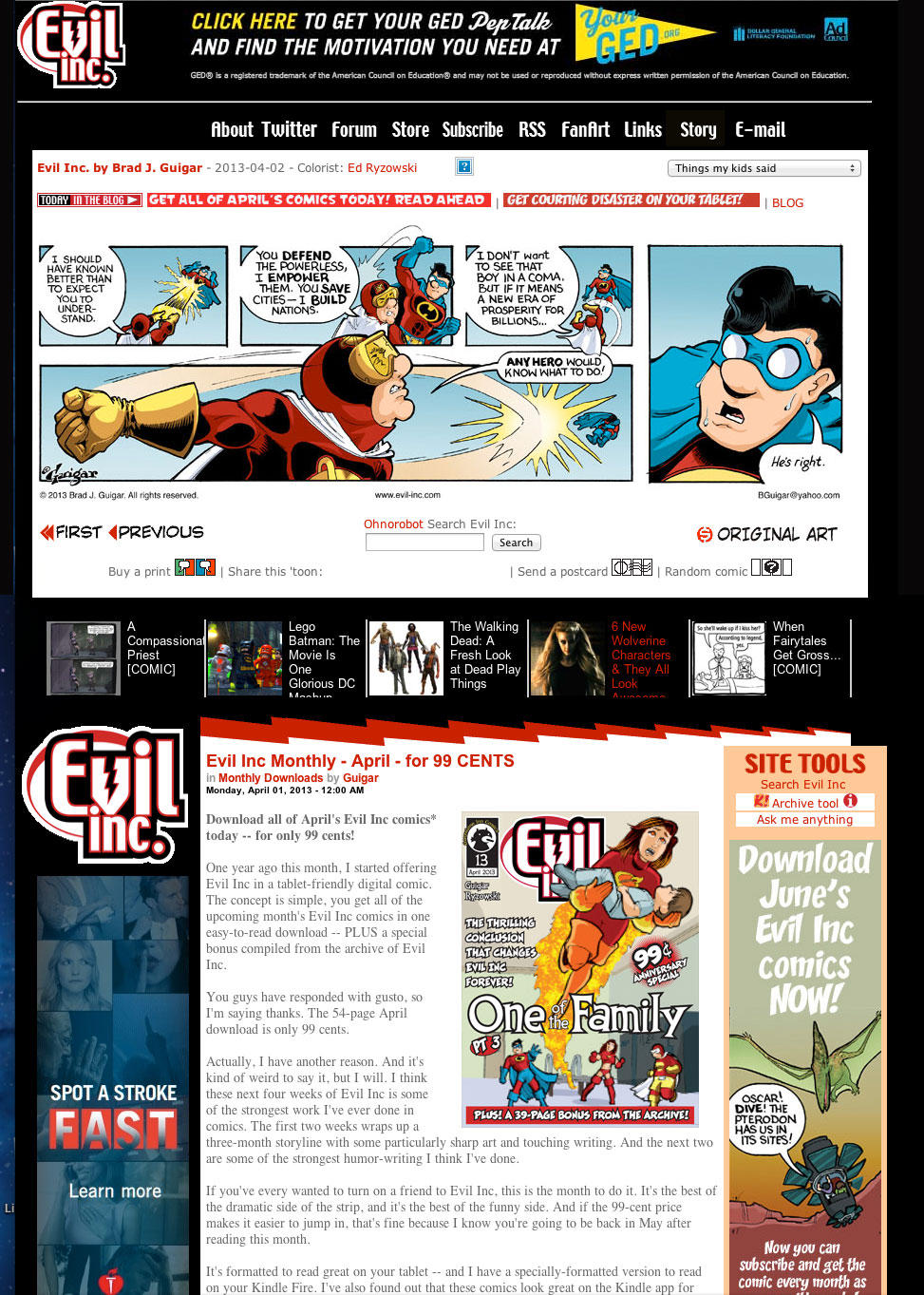
 To the right is the previous Evil Inc site layout. It made use of a leaderboard at at the very top and two skyscrapers on either side of the blog.
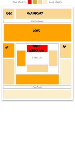
Below that is how the Google heat map related to that old design.
Hot spots
On a traditional webcomic site layout, you have four main, above-the-fold hot spots:
- Top of site
- Comic
- Under comic
- Under comic, left-hand side
 Here are a few thoughts on how you can maximize your hot spots — to not only improve your ad revenue but to increase the effectiveness of your reader-outreach as well.
Leaderboard: ‘Nuff said. The leaderboard goes at the top of the site. Nothing new here unless you don’t currently have a leaderboard.
Comic: Don’t underestimate the power of using the space directly above and below the comic. Comic Easel / WordPress has this functionality built in. Certainly, you could use this for simple advertising, but I find it much more valuable to use this space to send my readers important messages. Currently I have the above-the-comic space on my site serving a steady rotation of house ads through Google DFP. They can only be replaced by paid ads at a ridiculously high CPM. Oddly enough, I see paid advertising in that place from time to time.
Below comic: This is usually where most of us place our blogs, but it can also be a space for a shallow horizontal ad (like a banner). This can also be a good place for native advertising or promotion for your site or collective.
Below comic, on the left: I actually modified the original Comic Easel layout specifically because I wanted to get a bigger ad into that left-hand sidebar. Right now, I have a 300×250 ad at the top of that sidebar, and I’m experimenting with a whopping 300×600 ad at the bottom of the same sidebar. Bottom line: This is prime real estate that many of us are undervaluing.
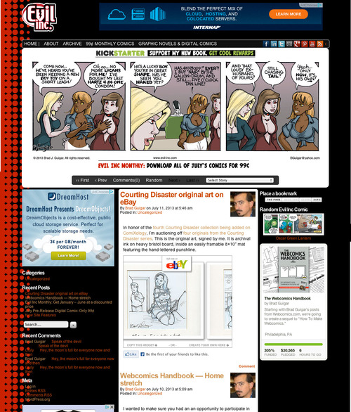
My new site design took a few steps towards maximizing the hot spots.


Recent comments