The Convention Flyer
You don’t need a subscription to read today’s post!
This is a re-post from the Webcomics.com archive. If you’ve ever been curious about the kind of information, tutorials and advice that you’ll get as part of your subscription to Webcomics.com, this is a good example.
If you’d like to join the site, you can get a 12-month subscription for $30 — or you can get a one-month Trial for $5 … with no obligation after your 30 days expire. For less than three bucks a month, you can get a steady flow of information, tutorials and advice targeted towards your webcomic business — plus a private forum to discuss issues with other professionally minded cartoonists.
From postcards and mini comics to key rings and even soap (yes I know!) there are many ways to promote yourself at conventions but there’s one method that’s ubiquitous: The convention flyer.
Cheap cheap cheap
There’s no point in breaking the bank, giveaways should be easily expendable because that’s exactly how many of your recipients are going to treat them. Most of these things get thrown away in the first ten minutes. Of the ones that get kept, only a small percentage get read.But that’s not really the reason I use them…
Conversation starters
Flyers are excellent conversation starters. Heck, for many attendees, the flyer is a welcome substitute for any sort of verbal communication. And that’s why I like flyers. For people who aren’t comfortable with one-on-one conversation (and that’s a pretty healthy percentage of convention-goers) the flyer can accomplish everything you want to get across — with zero personal interaction. And that’s just fine.
More importantly, during a lull, I use my flyers to generate a little interest. I can passively hand them out with a smile and little else. Or, if I get the sense that the attendee might be predisposed to liking my work, I can use it to stop him or her and gently initiate a conversation. If you’ve never done this, try it at your next con. People will almost always reach for something when you hand it to them. It’s instinctual. Once they’ve accepted the flyer, all you have to do is open the door, verbally:
“Would you like to check out my daily comic strip?”
Now, here’s where a seasoned pro knows how to dance:
- If they keep walking, smile and nod and remain friendly.
- If they pause and start reading the flyer SHUT UP and let them read.
- If they initiate a conversation, lead with your 30-second elevator pitch (if it’s appropriate). Otherwise, just engage in friendly chit-chat. You’ve stopped them. That’s an incredible feat with as much visual and audible stimulation that you’re competing with. Your job now is to be friendly.
Never, ever make disparaging, sarcastic or otherwise negative comments if someone doesn’t stay and chat. Why? Because I see it happen all the time. The person walks away with my flyer, reads it sometime later, and then comes back to find out more (or even initiate a purchase). Making a flip comment while the person was walking away would have killed that.
And that’s why I almost-always include one important piece of information on my flyer…
Convention map
Most of the time, I’ll print a batch of flyers specifically for one show, and I’ll include a map of how to find my booth/table on the show floor.
…But you’ll have to buy separately for each convention. That’s going to mean you can’t print them in advance, but remember, you can always ship them to your hotel.
Online printers
Flyers can be made incredibly cheaply. You might find a good deal can be made with a local print shop. Otherwise, there are several companies online that can do the job well. In the past, I’ve used VistaPrint, Overnight Prints, Next Day Flyers, PS Print and Boss Logo. They all do high-quality flyers, business cards, postcards and bookmarks.
OVERNIGHT PRINTS offers a loyalty program that offers special pricing to members. The more you order, the more points you earn. You can use those points to graduate to higher tiers (and higher savings).
VISTAPRINT has a premium member service, too.
RETAILMENOT: And before you place your order, put the name of the printer into a quick RetailMeNot search. You just might get a coupon code for extra savings. (Not for nothing, I do this before almost every online purchase I made these days.)
Just keep it cheap and within your budget. If you decide against using a convention map, buy in bulk at a cheaper unit-price and use them throughout the year.
Design
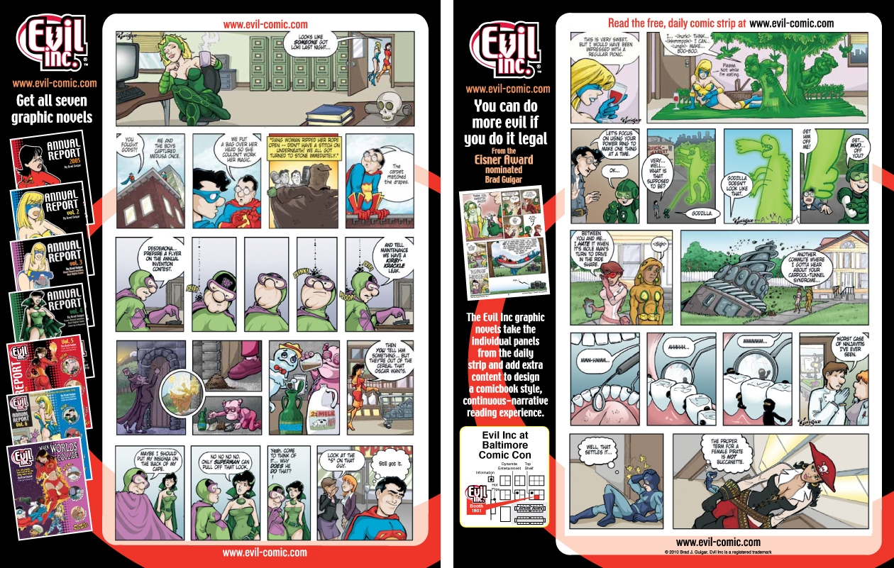
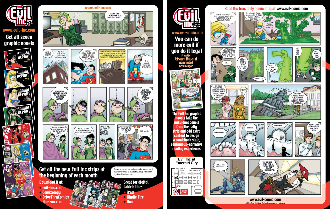
Flyers are a great way to quickly give people an overview of your comic. When you’re designing the flyer, provide as many samples of your best work as you can legibly fit, and don’t forget your URL. Consider placing your URL in several places on the same flyer to maximize the chance that people will be able to find it. Aside from a brief written synopsis of the concept behind the comic, there should be very little else on your flyer. Remember, the more stuff you try to fit onto that space, the less room you’ll have for your samples — and the samples are the most important things on the flyers.
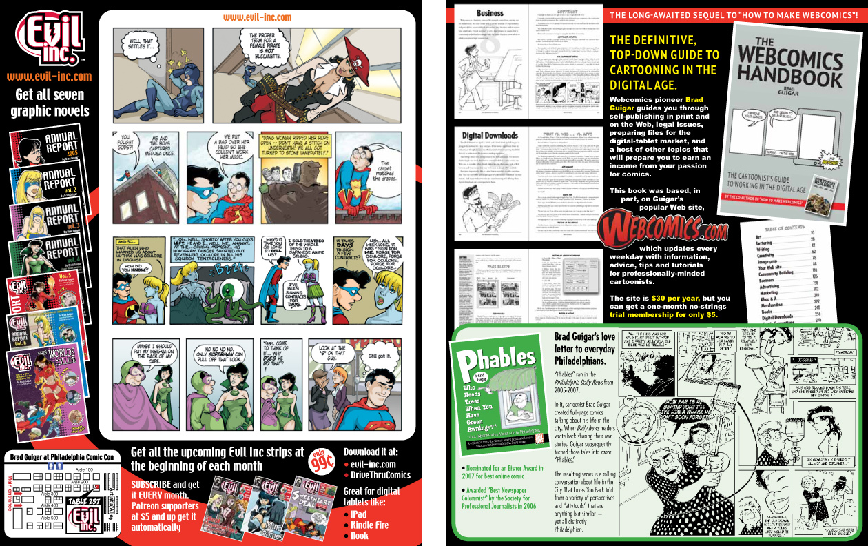
Here are some examples (click on the images to see them enlarged):
HERE ARE SOME THINGS I WANT YOU TO NOTICE…
• The samples are the most important elements on the pages. They are the biggest, they command the most attention, and they form the largest visual unit on either side of the page.
• I’ve chosen my samples very carefully. Each one is a gag that requires little (or no) background information to enjoy. They’re standalone gags. And they’re topics that I think the typical attendee at that particular convention would probably gravitate towards.
• My URL appears several times on either side of the flyer — top, side and bottom. It’s the second-most important visual element.
• Notice that nowhere on any of the flyers does it say “webcomic.” Nor does it explain my update schedule. And, heck, the only reason I have my name on one of them is because it allows me to include “the Eisner-nominated” in front of it. All of these words are virtually unimportant — especially when compared to the other elements, such as…
• Graphic novels and monthly e-comics are the third-most important elements on the flyers. Why? Because I’ve sunk money into attending this con in hopes of selling those things! Once my comic has (hopefully) hooked the attendee, it’s time to get down to business.
The double-duty flyer
Dave Kellett has an excellent technique that he used in designing flyers for his comic, Sheldon. On one side, all of the comics were chosen to appeal to as wide an audience as possible. They were all-ages, broad-appeal, family-style humor strips.
On the other side were strips with a heavy sci-fi and/or pop culture topic.
Then, he’d watch who was passing his booth. If it was a mom who was there because her kids wanted to see the convention, he handed a flyer to her with the first side facing up.
If it was a guy with Spock ears, a lightsaber and a Batman shirt, he would hand the flyer to the fanboy with the opposite side facing up.
One flyer was able to target two different types of convention goers.
I only steal from the best. So, after the Webcomics Handbook came out, I realized that my flyer had to do double-duty as well. One side had to pitch the comic, and the other side had to showcase the new tutorial. Not only that, but I was exhibiting in Philadelphia, and that meant that my collections of Phables comics would be of particular interest to the locals.
So I made my flyer do triple duty.



Recent comments