 Recently, I saw a webcartoonist asking for advice on convention banners. It’s a deceptively tricky topic — and it’s something I see done poorly at con after con.
Before you shell out your hard-earned dough on another convention banner that doesn’t work, take a little friendly advice:
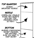
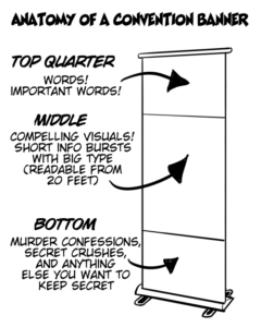
 The primary purpose of a convention banner is to attract attention to your table. Therefore, you need to get everything as high as possible. Putting important information at the bottom of your banner is a mistake — especially if the banner is going to be placed on the floor behind your table. Think about it. No one sees anything below the middle of a vertical banner from the aisle.
For the same reason, any type that’s not readable from about 20 ft away is too small. Make that type big!
And here’s one that has become even more important as webcomics have grown — do you promote the comic or promote the creator? There are pros and cons either way. But make your choice consistent. If the banner promotes the creator at the very top, be sure that the listing in the program matches. After 16 years of conventions, I can’t tell you how many problems I’ve caused for myself by bringing my “Evil Inc” banner to a con that I’m listed in the program as “Brad Guigar.”
You’d think I’d learn…
For further reading
Convention Table Signage
Tone Deaf Convention set-up
 You’ve been doing your webcomic for over ten years now, and you’re just not getting anywhere. Worse yet, you have family obligations and other pressures that make it hard for you to devote time to your craft. It’s time to make the hard decision — not to quit — but to let your creativity cocoon for a more opportune time.