You don’t need a subscription to read today’s post!
This post originally ran May 1, 2014. If you’ve ever been curious about the kind of information, tutorials and advice that you’ll get as part of your subscription to Webcomics.com, this is a good example.
If you’d like to join the site, you can get a 12-month subscription for $30 — or you can get a one-month Trial for $5 … with no obligation after your 30 days expire. For less than three bucks a month, you can get a steady flow of information, tutorials and advice targeted towards your webcomic business — plus a private forum to discuss issues with other professionally minded cartoonists.
The key to making your Web site look the way you want it to look is learning CSS. But that’s a skill that few webcartoonists have at the ready — and it’s one that few of us want to invest the time to learning.
Thanks to Philip M. “Frumph” Hofer, I got a CSS crash course — and a sneaky tip to guiding me through applying my new know-how to become a self-taught CSS wizard. (Note: hit the Comments section of the original post for some additional tech notes and tips for doing this using other browsers.)
Chrome plus Firebug
The first step is installing the Chrome browser from Google. Firebug — the app that we’re going to use to inspect the CSS on our sites — is also available for the Firefox browser, but Frumph frowned on Firefox for this use.
Next, obviously, we’re going to install Firebug Lite. Simply click that link from your Chrome browser and follow the install instructions on the screen. Once you’ve successfully installed Firebug, there will be a little insect icon in the upper right-hand corner of your Chrome browser.
(Click on each image for a larger view)

Go to your Web site and look under the hood
Mouse to any open space on your Web site (not on a link, 0bviously). If you’re on a PC, right-click. If you’re on a Mac, Option-click. You’ll see a pop-up dialogue box that offers many options. Select Inspect Element.
You’ll get a long window at the bottom of your browser window that looks like this.

Click on the magnifying glass at the upper right-hand corner of that window.
Now, mouse over a part of your site that you’d like to improve.
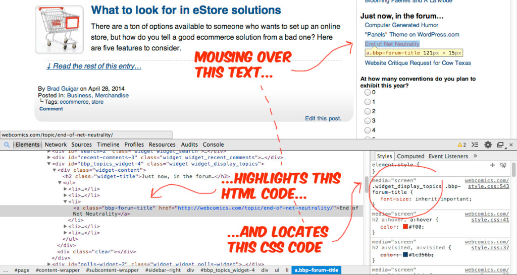
You’ll see areas highlighted on your site — and corresponding areas highlighted in the Inspector window at the bottom.

The window is split into two sections. On the left is the HTML associated with the highlighted area. On the right is the CSS code that’s being called into play in that area.
And just like that, you know which part of the CSS code you need to alter to adjust that element on your site.
Not so fast
A couple words of warning…
One bit of CSS code might control the look of several different element on your site.
For example, when I altered the Bulleted List style of Webcomics.com, I went to the Forum and saw that the entire style of that section of the site had been changed as well!
(Don’t worry. It’s fixable.)
Also, be sure to give that code in the Inspector a good, hard look. It might be that the code you’re looking for is a few lines higher or lower than the highlighted area.
The more you do it (and learn by trial-and-error) the more this will make sense to you.
Making an adjustment to your site
Let’s do a quick walk-through of Firebug in action.
Let’s say we wanted to adjust the spacing under those category headers on Webcomics.com.
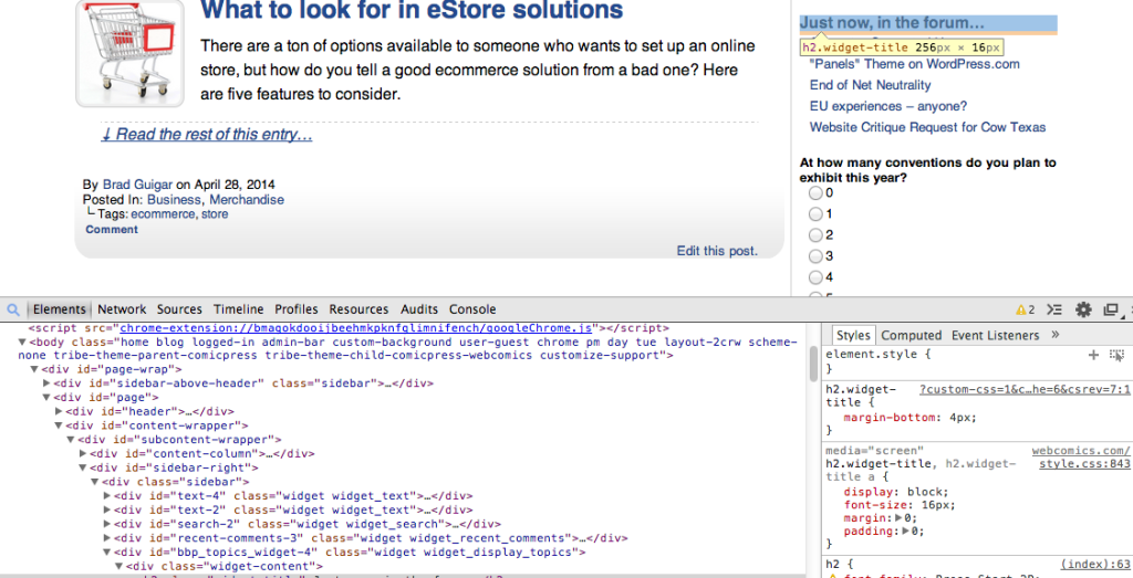
Mousing over that section shows us this.

In the Inspector window, you will see: html body div#page-wrap div#page -> etc. Those are the HTML elements that encompass this section of the Web site.
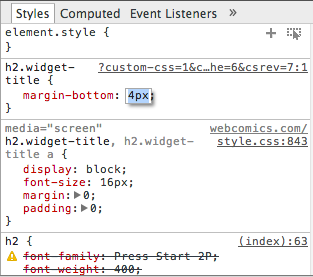
Looking through the CSS section, I see “margin-bottom.” Looks like a good place to start. Clicking to the right of the amount (10px), a box opens up.
 This is where it gets cool. Type a different amount into that box and then look up at your Web site.
It makes the change — in real time — on the Web page above.
Don’t worry. It’s not permanent (and nobody else visiting the site can see it). But using this feature you can tell:
- Whether you’ve chosen the correct variable to alter and…
- How that change will look on your Web site.
Here’s something else to pay attention to.
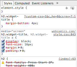
As you mouse over different part of code in the CSS section, you’ll see little checkboxes appear…

Un-checking the code shows you what the affected areas in the page above would look like without that bit of CSS applied. Heck, you can even click under the code and add further variables.
Finally, note that little grey text to the right of each CSS code entry. That tells you which line inside the style.css file it occupies (which can be darned useful to know if you ever have to go hunting for it. In the example above, the CSS code h2.widget-title is on line 843 of style.css.
But unless you’re not going to hunt for it. There’s a better, more efficient way of making changes to your CSS.
Change that CSS
Instead of making changes to style.css, you’re going to override it. Assuming you have the Jetpack plug-in installed (and it’s highly recommended that you do), go to your WordPress dashboard and select Appearance -> Edit CSS.
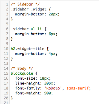
To override that margin in the example above, you would add the following CSS code to the CSS Stylesheet Editor:
.sidebar .widget {
 margin-bottom: 20px;
 }
Now, chances are, you’re going to do a fair bit of tweaking, and if you’re not careful, this file is going to turn into an unfamiliar mess of tangled code. So add some headers in between these symbols /* */. That will help you find things when you’re looking for them later. Here’s an example:

Once you plug in your override — and save the file — clear the cache* of your site, and your site will now appear to everyone with the CSS override you installed.
* (Varnish HTTP Purge is another highly recommended plug-in)
Baby Steps
Does this take the place of learning CSS? No, not really.
But is this an excellent way to familiarize yourself with CSS so it doesn’t seem so unchartable? Well, that was my experience. And that’s the first step to learning, isn’t it? In fact, I spent a couple hours just poking around my own site and seeing what changing different numbers would do. In the process I learned tons about CSS that I didn’t know before. And through a little trial-and-error, I fixed all sorts of things that had been bothering me about my site that I had no ability whatsoever to change before.


