For this round of Hot Seat critiques, I wanted to focus on social media. I attribute a huge portion of the success I had with my recent Kickstarter on the effect of social media. It’s how information gets passed around, and I think it’s worth spending a little time discussing.
So here’s the three criteria I focused on:
- How easy was it to ascertain the social-media presence of the comic/creator?
- How easy was it was to share links to the content on social media (outgoing social-media).
- Did the main social-media feed of the creator (incoming social media) feature a good ratio of content to commercial?
I gave each a score on a five-star scale, with five stars representing the best possible outcome.
As always, this is just the beginning of the discussion. Members are encouraged to take this as a jumping-off point to a deeper discussion of the topic.
- Finding social media links on-site: ★★
- Sharing through social media: 0 stars
- Quality of incoming social-media feed: ★★★
I was able to easily find the link to the MeatShield Facebook fan page, but I was disappointed that there was no presence of any of the other prominant social media — especially Twitter. And I don’t see any way to share links to this comic through social media. That means if I come to today’s comic and love it, I can’t easily share that love. And, being a typical member of the attention-disorder-ridden Internet public, if I can’t do it now, I’m not very likely to remember to do it later.
Visually, the fan page for Meatshield is bare bones. Although Facebook has an option for a large image across the top, Meatshield only uses a small profile picture. But the posts themselves feature a decent mix of promotional and fun content. There are posts about the creator’s personal life, and there are posts that are clearly aimed at the Meatshield demographic. And, interspersed with those are promos for the comic. Not bad at all.
Suggestion: Add Twitter. And add sharing. This is a WordPress site so perhaps a plug-in such as JetPack would be a good start.
- Finding social media links on-site: ★
- Sharing through social media: 0 stars
- Quality of incoming social-media feed: ★
 I almost missed the text-only link to the creator’s Facebook fan page. As Internet users, we’re kinda trained to see those familiar social-media icons. I think it’s a good idea to use that repeated symbology to your advantage. The white “f” reversed out of a blue box is instantly recognizable. The word “Facebook” gets completely lost.
There’s no ability to share my fandom of this comic with anyone through social media on this site.
Although there is an attractive facebook fan page for the comic, the posts are almost entirely promotional — with very little representing the “social” aspect of social media.
- Finding social media links on-site: ★
- Sharing through social media: ★★★
- Quality of incoming social-media feed: ★★★
There’s a small link to the Facebook fan page for Johnny Saturn, but it’s well below the first-screen view, so it may as well not be there at all. I might experiment adding the Facebook “f” to the column of icons to the right of the comic.
This comic has a row of social-media icons, but the links are too far away from the comic to be useful. I’d like to see them right under the comic. Perhaps using this method would help.
Although the page itself is attractive, I’d like to see a better content-to-promotion ratio on the Facebook fan page. Almost all of the posts promote updates and merchandise. But there’s no outreach — no conversation-starting or community building. And there are no posts more recent than mid-July. I will say that I like that some of the promotion is pretty savvy. For example, some of the posts share scans of commissioned art as a way of promoting the fact that it’s possible to purchase commissioned art. But overall, I’d like to see a little more fun talk.
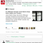
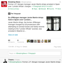 As you’re scrolling through your Twitter feed, you may notice that some of the posts have a small link under the tweet: “Show summary.” When you click the link, you get a tidy synopsis of the subject of the tweet (provided the tweet links to a Web page).
