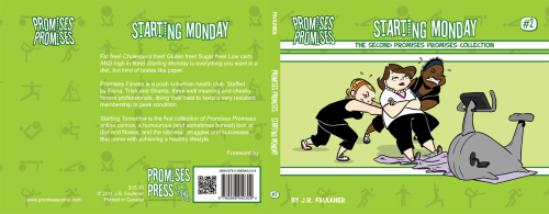
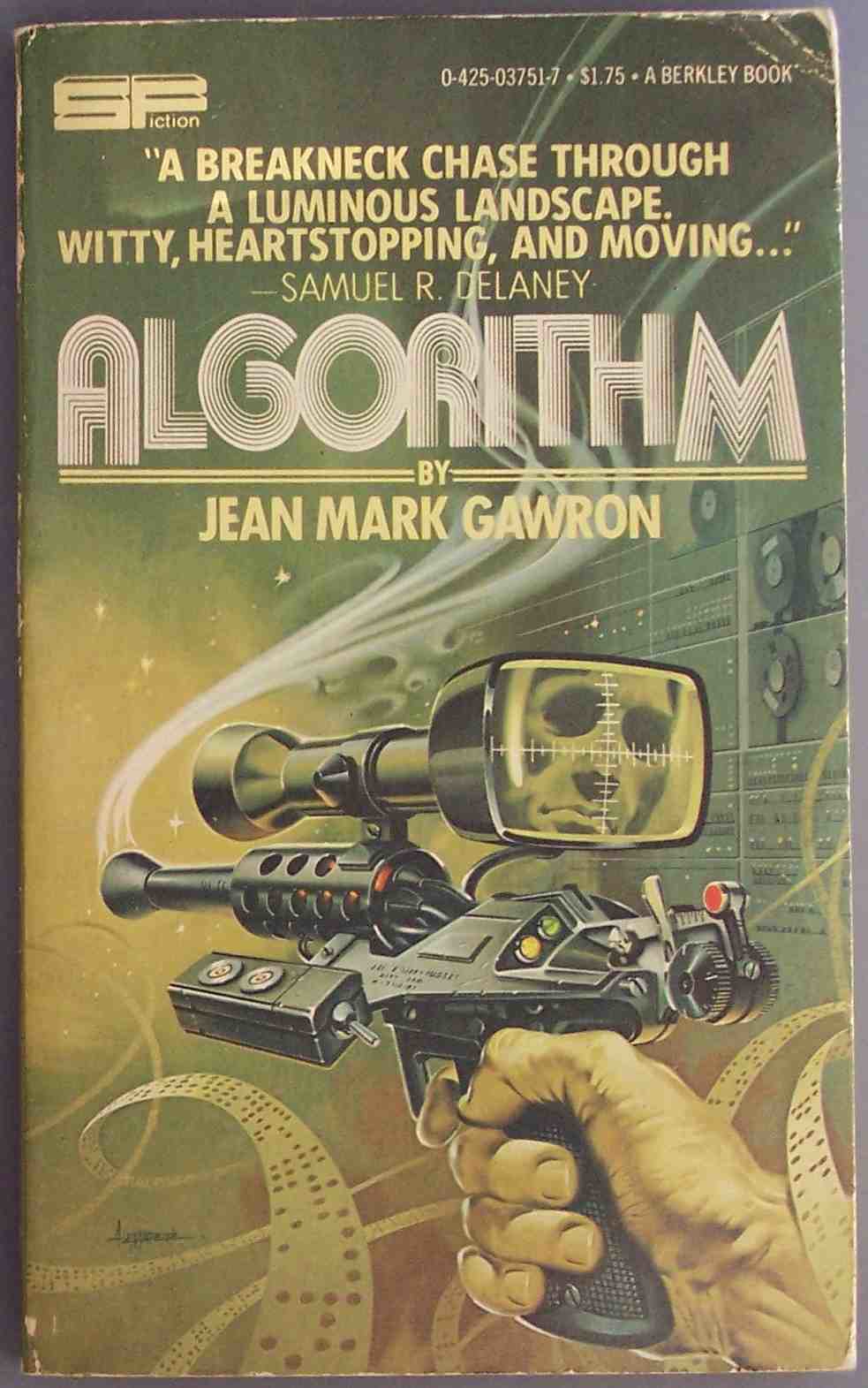
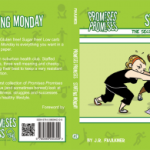
 Q: I’ve started production on my second print collection of comics and was hoping I could get you to talk a bit about your book covers.
I like the layout of my first one, and I’m thinking of going with the same theme, but new title and new character illustrations, different colours, much the way you did the first four Evil Inc Annual Reports. You’ve started switching up five and six a bit, was this a business decision or personal design preferences? Are you finding the variety helpful or harmful to sales in any way? Do you have any recommendations, keep a theme, change the theme? And how important is it that the two books compliment each other side by side or on the shelf? For example, in terms of colours should I be worried if the two covers clash? Should I make a point to choose complimentary ones? (I don’t know if that’s over thinking on my part.)
The content you are trying to access is only available to members.
