Patreon has proven to be a game-changer for may people pursuing webcomics. But some new patrons have a hard time navigating the Patreon interface to get the most out of their patronage. While I don’t mind seeing “my financial situation has changed” and “I only intended to pledge for a limited time” in my Patron Exit Surveys, I hate seeing “I’m not happy with Patreon’s features or services.“
To be fair, the “I’m not happy…” response appears rarely. But, in optimizing my Patreon approach, I’ve created something that I’m seeing very positive results from…
The Video Walkthrough
I recorded a brief screen recording of me navigating Patreon, narrating the process and adding titles to help patrons fast-forward to each new topic.
In my walkthrough, I covered:
- Patreon Messages
- E-mail settings
- Posts Page
- Tags
- How I use tags to denote different content types
- Downloading files through Patreon
- How to see content bigger
- Dropbox links
- Dropbox navigation
- Getting updates on new posts
- Commenting
- Posting to the Community Page
- Commissions
- How to contact me
- How the pledge system works
Mind you, much of this stuff is covered in my welcome e-mail. But, let’s face it, most people give that a skim at best.
Getting your video seen
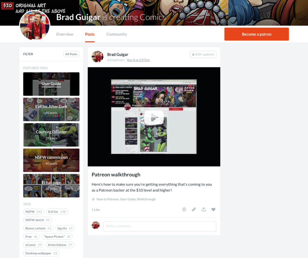
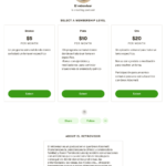
Once I posted the walkthrough video to my Patreon page, I tagged it as “User Guide,” and made it one of the Featured Tags on my Posts page. In fact, I made it the top Featured Tag:
Now, it has a position of prominence on the Posts page. So as new users are trying to navigate the system, it’s very likely to be spotted — and used to help them solve their issues.


