November was an excellent example of the tremendous value offered by a subscription to Webcomics.com. My readers got early alerts on issues that would impact their businesses, helpful tutorials, insightful analysis, and meaningful feedback on their work. Here are some samples of what you may have missed…
Tailoring Your Comics for Social Media

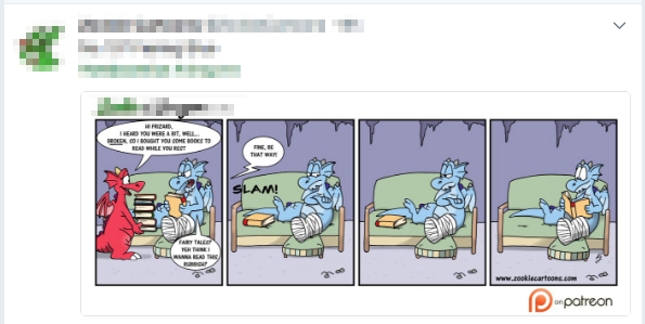
In a post-advertising webcomics publishing plan, the goal is no longer sending traffic to your site. If your social-media approach doesn’t reflect your understanding of this concept, you’re wasting valuable time and effort on ineffective promotion. In other words, if you’re convinced that Twitter and Facebook just don’t work, take a hard look at what you’re doing. Chances are, the problem starts there.
[Subscribers only]
 Patreon Pro Tip — Setting Links to Expire
Here’s a handy pro tip for people running Patreon campaigns. If you’re like many of us, you love Patreon, but many aspects of navigating the Creator Feed are… lacking. And you want better for your backers. So — once their payments have processed — you send out a link to a Dropbox folder so your backers can access the exclusive content outside of Patreon’s clunky interface.
Of course, once that link is out there, anyone could use it to access that content. And that’s a little troubling.
This pro tip is for you…
[FREE FRIDAY post — read it without a subscription]
Shipping — holiday deadlines and rate hikes for 2018
Shipping through the United States Postal Service will get a little more pricey in 2018 — by about 2-4%. But that hike will still be lower than the price increases planned by both UPS and FedEx. Those prices will increase by about 5% for each company. Also, holiday shipping deadlines are looming.
[Subscribers only]
 Social-Media Promotion: Be a Sniper
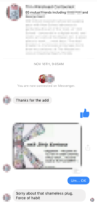
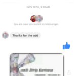
I got a Facebook friend request from a cartoonist, and, as usual, I accepted. Within seconds I got a “thanks for the add” direct message. Friending is not exactly an “add,” but I decided not to split semantic hairs. I sent him a thumbs-up icon as an acknowledgement.
Immediately, he direct-messaged me his business card. (Please read Business Card Etiquette if you haven’t already. It applies to digital business cards, too.)
I unfriended him a few minutes later.
Why? Because he was annoying?
Partly. But mostly I did that for one, important reason…
[Subscribers only]
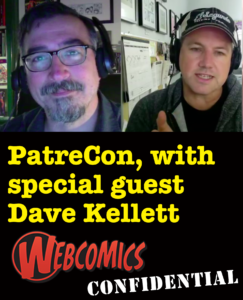
 Webcomics Confidential Ep 36 — PatreCon
My friend (and former podcast co-host) Dave Kellett attended PatreCon — a conference for Patreon creators — earlier this month. Featuring workshops by industry leaders and creative professionals, this invitation-only, two-day conference brought creators from all backgrounds together in Los Angeles for an intimate, collaborative, and educational weekend.
Dave learned a lot in those two days, and he joined me on Webcomics Confidential to talk about it…
[Subscribers only]
Preparing for the holidays

Back in July, I have you a heads-up to start planning holiday merchandise. Well, surprise! It’s November! In case you need to catch up, here are a few thoughts…
[Subscribers only]
[FREE FRIDAY post — read it without a subscription]
Kickstarter Launches Patreon Competitor — Drip
Kickstarter has announced Drip — a Patreon-like crowdfunding platform for ongoing creator support.
[Read it without a subscription]
 Webcomics Turn 20
With Scott Kurtz tabling at PAX UnPlugged in my home city of Philadelphia, I was able to spend a lot of time with my friend. With his comic, PvP primed to celebrate its 20th anniversary, we spent a lot of time reminiscing about the Old Days of webcomics — with each other and with some of the PAX attendees who remembered mutual projects like Webcomics Weekly. During one of those conversations, someone said:
“During those early days of Print vs Web, you guys spent a lot of time railing against the Old Guard who refused to change with the times. Now, you’re becoming the Old Guard. Does that scare you?”
The question set me back on my heels. I thought about it, and I came to a surprising conclusion…
[Subscribers only]
 Webcomics Confidential Ep 37 — Dylan Meconis
Audio only! I invited Dave Kellett back to the studio and we talked shop with the inimitable Dylan Meconis. Dylan started webcomics around the same time as Dave and I, but she has charted a much different path for herself. We had a phenomenal discussion about the past (gasp) 20 years.
[Subscribers only]
 Patreon Pro Tip: Record a Walkthrough
Patreon has proven to be a game-changer for may people pursuing webcomics. But some new patrons have a hard time navigating the Patreon interface to get the most out of their patronage. While I don’t mind seeing “my financial situation has changed” and “I only intended to pledge for a limited time” in my Patron Exit Surveys, I hate seeing “I’m not happy with Patreon’s features or services.”
To be fair, the “I’m not happy…” response appears rarely. But, in optimizing my Patreon approach, I’ve created something that I’m seeing very positive results from…
[FREE FRIDAY post — read it without a subscription]
 Affiliate Advertising During the Holiday Season
As we head into the holiday shopping season, you might consider redoubling your commitment to blogging. We often talk about the importance of blogging here — as a way to establish and define Community — but this time of year, it takes an added importance… potential affiliate ad revenue.
[FREE FRIDAY post — read it without a subscription]
 Creators for Creators Grant
The Creators For Creators Grant was first announced at Image Expo last year. This year, they’ve announced a second round of funding. From the website:
We plan to give $30,000 to a single cartoonist or writer/artist duo in order to support the creation of a new and original work of a length between sixty-four and one hundred pages over the course of a single year. The recipient will be selected by committee according to rigorous criteria.
[Read it without a subscription]
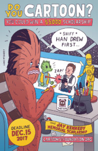
 Jay Kennedy Memorial Scholarship deadline
The deadline for the Jay Kennedy Memorial Scholarship is Dec. 15. Applicants must be students at a 4-year college in the United States, Canada or Mexico who will be a Junior or Senior during the 2012-2013 academic year. Applicants do not have to be art majors to be eligible for this scholarship.
The winner will receive:
- $5,000 monetary award
- Trip to the National Cartoonists Society’s Reuben Weekend.
[Read it without a subscription]


