Webcomics.com poll
The new Webcomics.com poll asks one of the most burning questions in our field: How many comics are in your buffer?
The new Webcomics.com poll asks one of the most burning questions in our field: How many comics are in your buffer?
It’s time for another “Hitch It / Ditch It” Hot Seat. If you participated in the “Hitch it” Hot seat earlier this year, please sit this one out!
The rules are simple: I go to your site and point of one thing you’re doing well, and one thing that might stand some improvement. The discussion goes on from there are the members join in with their thoughts.
To participate, please give me the following in the Comments below:
• Your name
• Comic title
• Your comic’s URL
The results of the most recent Webcomics.com poll are in, and it seems that a once-a week update schedule is the favorite among the webcartoonists who responded.
Here are the breakdowns, and a few thoughts:
The content you are trying to access is only available to members.
You don’t need a subscription to read today’s post!
This is a re-post from the Webcomics.com archive. If you’ve ever been curious about the kind of information, tutorials and advice that you’ll get as part of your subscription to Webcomics.com, this is a good example.
If you’d like to join the site, you can get a 12-month subscription for $30 — or you can get a one-month Trial for $5 … with no obligation after your 30 days expire. For less than three bucks a month, you can get a steady flow of information, tutorials and advice targeted towards your webcomic business — plus a private forum to discuss issues with other professionally minded cartoonists.
I’ve been writing for this site since 2009, and I see a lot of webcomics. I initiate critiques, I get asked to do portfolio reviews at conventions, and I do comic consulting. I do it because I like it. I love talking comics, and I like having the opportunity to pass along the things I’ve learned by doing this for so long. AND, as I often say — here and to my classes at Hussian School of Art — I’ve already made all the mistakes so you don’t have to.
In seeing all of those webcomics, I see a lot of the same mistakes pop up over and over again. So I want to isolate the top five — not in a “boy are you a loser” way. Rather, since many of these are so widespread, my hope is that we can take some big steps to eradicating these six.
Number one should be no big surprise…

CC BY-ND Brandi Redd
I’ve said it before, and I’ll say it again. If you improve your lettering tonight, your readers will perceive you as 100% more professional tomorrow. There’s a lot of good information about lettering — both hand-lettering and digital — on this site. It’s worth your time to read through as many of those posts as you can. But here’s some bullet points:
• Don’t let your words touch the lines of the word balloon. Ever.
• Keep an equal margin inside the word balloon (between the text and the lines) — all the way around. If you have more space at the top and bottom than you have on the sides, your balloons will feel awkward.
• When word balloons get huge, chop them into smaller balloons.
• Never, ever cross word-balloon tails. Ever.
• The words inside balloons should look like units — not as separate lines of text. If they look like separate lines, tighten up that leading (the space between lines of type). This Hot Seat critique of House of Madness does a good job of explaining this.
• Don’t use Comic Sans. It’s not a very graceful lettering font. And, seriously, with the number of affordable (if not downright free) comic-lettering fonts on sites like Blambot.com and Comicraft.com, there’s just no excuse.
• Word balloons that span the width of a panel — especially if they’re only one or two lines of type — look awkward. Use them sparingly.
• If you use a funky font to denote an alien voice or an ancient text, that’s fine. As long as it’s legible. It may look exactly like Renaissance script, but if I can’t read it, it may as well be gibberish. Same goes for the old “use a weird voice for the alien/robot/’other’ character.” Try this instead — challenge yourself to describe that character’s “otherness” in the words and phrases the character chooses. It’s waaaaay more powerful than a funky font.
• If you’re hand-lettering use an Ames Lettering Guide. It’s cheap, it’s easy, and it’s indispensable.
 Write it. Put it away. Come back to it later. Re-write it.
Nothing is very good in its first draft. That’s why they’re called first drafts. If you’re not re-writing your material, chances are, you’re posting stuff that’s not very good. When you’re re-writing, look for stuff like…
• Spelling and grammar mistakes. I’ll point it out before anyone decides to “out” me. I’m as guilty on this one as anyone else. It doesn’t mean you can ignore this tip, though. It just means I need to pay attention to it just as badly as some of you do!
• Edit, edit, edit. This is comics, people. It’s all about quick, rewarding entertainment. If you can say it in fewer words, you will — nine chances out of ten — improve the reader’s experience. Usually that’s because saying it in fewer words means making better, more descriptive word choices. And that’s Good Writing.
• Remember the visual! We cartoonists have a secret storytelling weapon. We’re presenting images along with out words. Let the two word together. And if the visual is doing its job, get the words out of the way. In other words: show, don’t tell.
• For those of you doing humor: Don’t step on your punchline. Decide where the funniest part in the comic is, and after that — stop! If you write something after the punchline — and it’s not as funny or funnier than the punchline — you just ruined your joke.
 With WordPress theme/plugin combos such as ComicsPress and Comic Easel, this stuff should be easy, but it’s not always.
• First screen appeal. We’ve discussed it a lot. Basically, it’s like this. First-timers aren’t likely to scroll down. And if you need to scroll down to read a comic, it’s going to have an adverse effect on how long someone is going to read through your archive. You need to get as much of your site onto the reader’s first-screen view as possible. And that means…
• Ditch that huge header graphic. I’ll be honest with you, the sites I think work the best have a logo to the left of a leaderboard ad across the top of the site. And, really, I don’t know that a comic needs much more than that for branding. After all, the comic itself is going to carry a lot of that responsibility.
• Put the navigation buttons as close as possible to the comic itself. Personally, I like to see them snug underneath the comic. I also prefer standardized arrows over text (a deficiency I keep meaning to address in my own site).
• The About page. Man, you’re missing out on an excellent opportunity to cement a possible new read if you don’t have this.
 Yup, it’s part of webcomics. It’s a big part of how marketing and promotion are done. Not comfortable? Get comfortable.
Here’s the irony: It takes almost zero writing skill. People aren’t looking for the Great American Novel at 140 characters at a time. They want to know about you. What you’re thinking about. What you’re doing. How you feel about that. It doesn’t have to be deep or inspirational or funny — but those kinds of posts are extremely powerful when they come along. But 85% of it is simply sharing your life in bits and pieces.
We discussed this in an Archive Dive last month. It’s definitely worth a read if you haven’t yet. In short, cargo-cult mentality involves mimicking the actions of successful people — without understanding why those people are doing what they do. If you’re planning your first T-shirt run before you’ve built a sizable audience with your comic, you might be someone who could fall into this category.
If you’re just starting out, you should be concentrating on making an awesome comic — and then doing it with frequency and consistency. Only after you’ve mastered that should you allow yourself diversions such as merchandise.
Hands down, this is the single most important concept to understand for webcartoonists. Nothing is as important as this.
Every day a certain number of people come to your site for the very first time. And they make their decision on whether they will read the comic based on the comic that is posted on that site on that day.
If that comic doesn’t…
• Make sense
• Have importance
• Make an impression
…those readers will leave. And they won’t come back.
“Hey, but what about my archive?”
Have you ever gotten into a disappointing experience and then felt the overwhelming urge to extend that experience?
Neither have I.
Neither will your readers.
They’ll only read your archive if today’s comic intrigues them into doing so.
If you’re doing a longform comic, that may mean that you have to rethink your publishing approach.
If you’re doing a strip, that means every day has to be fantastic. (Or as close to fantastic as you can possibly get.)
If you’re posting something that relies on knowledge of one (or worse — several) days of archived backstory, you will lose that first-time reader on that day.
And if you consistently miss the opportunities to convert those first-time readers, your site will fail to grow — and, potentially, wilt and eventually die.
Google has updated the way it crawls WordPress sites. With the latest update to Webmaster Tools, it is requesting access to all of the JS and CSS files so they can render the entire site. Since some of those site files are located within /wp-includes, that section now needs to be accessible during the crawl.
Here’s a quick guide:
The content you are trying to access is only available to members.
Gumroad has released a new app that enables you to track your sales.
The content you are trying to access is only available to members.
Now, more than ever, it’s easy to see what a subscription to Webcomics.com will get you.
Every Friday, you can read the entire Archive Dive post without a subscription. This is a post from the site’s archive that I pull out front again because it still has relevant information you can use today. This is especially nice for newer subscribers (or anyone else) who may have missed it when it originally ran.
Plus, at the beginning of every month, I do a wrap-up that highlights some of the best posts — from the site as well as the private forum — from the preceding month.
If you’re curious about joining, we’ve made it easier than ever with a $5 trial membership. You’ll get full access to the site for thirty days so you can see what you’ve been missing. At the end of the trial, you can choose to re-subscribe ($30 for 12 months of access) or walk away with no strings attached. You will not be re-billed unless you choose to subscribe.
Please note: The links below will lead you to content that is “subscription-only” content. Why do I do this? Simple. If you see something that intrigues you and decide to subscribe, you can come back here and use this post to jump right to the post that caught your attention. And once you do that, use the other Best Of posts to drill even deeper into the site!
Patreon’s decline pledges: When Patreon experienced a glitch that resulted in a large number of declined pledges, we alerted you to the situation, and told you what to expect as the problem was being addressed.
Understanding Patreon revenue: A Patreon pledge total is never the amount a creator sees at the end of the month. Even after the (reasonable) amount that gets taken out by Patreon and Swipe (the company that handles the credit-card transactions), there are other variables that affect that final tally.
Convention fan art: Funimation released an official statement in regards to convention fan art. Our analysis reveals what this means for creators exhibiting at cons.
Google Webmaster Tools: Google provides some great tools for better understanding your site and your traffic. We give you a quick start-up tutorial.
Adding a sitemap using Google Webmaster Tools: Now that you’ve started using Webmaster Tools, we give you a tutorial on setting up a sitemap.
“On the Spot” Hotseat critique: We finished up the most recent Hot Seat critique series. This one looked at a participant’ site and comic on one, random day.
Gumroad Affiliate links: Gumroad added an affiliate program that you can offer your readers. We give you a head start on implementing it.
Orphan Works Hysteria: A YouTube video and a mass of mailings from some very well-intentioned people spread panic throughout the comics community. Creators were told that legislation in front of Congress was going to change everything about copyright. There was no legislation. And the potential changes being considered are less threatening than we were being told. Katie Lane, a lawyer specializing in creative professionals, took time out from her blog, Work Made for Hire, to give us an educated analysis of the Copyright Office’s planned changes from the perspective of a lawyer.
Studio Tour — Adam Huber: Bug Martini’s Adam Huber give us a guided tour of his studio space.
Webcomics Panels: I’m hosting webcomics panels in Chicago, Columbus (Ohio), and Ft. Lauderdale. If you’d like to participate, please get in touch.
Patreon improvements on the horizon: Patreon has some important improvements planned — and some of them are overdue. We give you an guide to what to expect.
Combatting Patreon’s “ghost pledges”: It’s a big problem or some creators who use Patreon — “ghost pledges” from people who either disappear before their cards get charged or whose cards are declined.
A “Comics Oasis” in Las Vegas? Please: From time to time the rumors about Comic Con International leaving San Diego resurface. One of the often-pitched replacements is Las Vegas. Here’s why that’s never going to happen.
Google, Minus Plus: Google has made some changes in how it pushes Google Plus on users. Many are forecasting this as the death knoll for Google’s “Facebook killer.”
When a “publisher” proves s/he has no grasp on the business model: This site offers continuous warnings about signing contracts with pseudo publishers and cyber “studios.” One of the main reasons is this: It’s easy to set up a Facebook page or a swank Web site, but it’s really difficult to actually run a publishing business. And if you sign on with someone who’s faking it, it’s your business that he or she is going to drag down. This case study is an excellent example of what I’m talking about.
Inside the Cartoonist’s Studio. If you’d like to share a tour of your studio, please follow these instructions.
Should I wait to start a Patreon campaign until I have a bigger readership? (Or can you use Patreon as your audience grows?)
If I can’t update consistently, can I update consistently inconsistent?
We’re well into the second half of the year, believe it or not. Now’s a great time to start planning the rest of your 2015.
The content you are trying to access is only available to members.
Banner advertising has always been a low-cost/high volume endeavor. (Not counting a blissful period of time before the dot-com bubble burst.) But, as more users access the Web on mobile devices — and, increasingly, through apps — that volume has decreased. (See this NYTimes piece for an excellent analysis of this.)
This has caused online advertisers to launch more and more invasive, aggressive advertising campaigns — video, pop-ups, interstitial ads, and ads that hijack your browser entirely.
And as ads become more of an intrusion, demand for ad-blocking software rises.
Which spurs even more aggressive advertising, and so on.
But, to Web publishers, the damage reaches even further than ad revenue. Tell me if the following story sounds familiar to you:
The content you are trying to access is only available to members.
You don’t need a subscription to read today’s post!
This is a re-post from the Webcomics.com archive. If you’ve ever been curious about the kind of information, tutorials and advice that you’ll get as part of your subscription to Webcomics.com, this is a good example.
If you’d like to join the site, you can get a 12-month subscription for $30 — or you can get a one-month Trial for $5 … with no obligation after your 30 days expire. For less than three bucks a month, you can get a steady flow of information, tutorials and advice targeted towards your webcomic business — plus a private forum to discuss issues with other professionally minded cartoonists.
Today’s post has been very kindly submitted by Mary Cagle:
Something that drives me crazy about a lot of cel shading is that the artist only lines the edge of their figures with shadow.
As a demonstration, here’s a recent panel of my comic shaded in such a way:
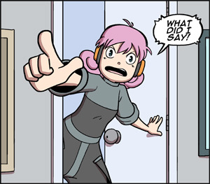
While cel shading is about simplifying forms and quickly adding depth to an image, doing it in this way completely ruins the point of shading.
Shadows should, as a minimum, give an impression of:
The problem with shading “on the edge” is that it completely ignores the latter. Whether an object is a sphere or a pyramid, it’s getting the same treatment. What this tells the eye is that all objects in the image have the same depth and shape, like a carved relief.
To help figure out the best way to use cel shading more powerfully, let’s go back to the basics.

Here are a basic sphere and cylinder, rendered realistically. If you’ve been in any art class, you probably had to do these. When they are shaded like this, you get the impression of the form through a subtle use of gradients and highlights. But we don’t always have this luxury in cel shading. We have to pick a single line along which to shade, and that line needs to define the entire form.
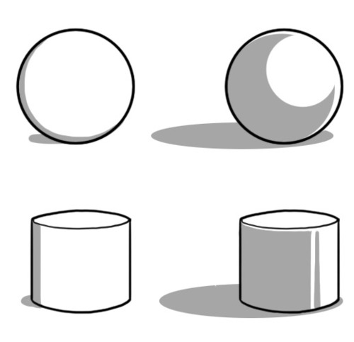 Now here’s two versions of the same shapes, cel shaded this time. The left has that on-the-edge shading, while the right is how I might shade these objects. See how much more round the objects on the right look?
If you work in pure black and white, you may have heard to 70/30 rule: a balanced page is often either 30% black or 70% black, with the rest being negative space. I’ll submit that a similar principle works for cel shading: a balanced shadow on a round figure will take up 30 to 70% of said figure. Going far to either side makes it look like your light source is very bright or very dim.
I think a lot of the reason people end up resorting to minimal cel shading is because they aren’t sure what shapes to make the shadows, if not a thin line. After all, character forms can be complex and hard to visualize for shading purposes.
However, I find that it helps to think of characters in terms of simplified forms, much in the same way you might construct a figure when you’re drawing them.
For instance, if we go back to my chosen panel:
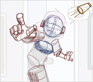
On the simplest level, this character is mostly composed of distorted cylinders and a few spheroids. So while it may be hard to figure out how to shade “a face” it’s not too hard to shade a sphere that happens to have a triangle (the nose) on it and some holes in it!
That in mind, this is what the actual shaded panel ended up like:
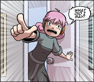
Of course, there a number of subtleties when it comes to overlapping forms and artistic license, but I’d encourage anyone who’s hiding their shadows on the edge of their figures to try experimenting with this mindset, and let your shadows help bring depth to your world.