To run a successful Kickstarter campaign, you must understand the concept behind the Kickstarter Ladder. The Kickstarter Ladder works like...
Read More


As you know, the Friday after Thanksgiving officially kicks off the holiday shopping season for brick-and-mortar retailers. The following Monday, “Cyber Monday,” is the official launch for online sellers.
The content you are trying to access is only available to members.
When Transcontinental discontinued its offer to give Webcomics.com members a 10% discount, it gave me an opportunity to rethink that feature of the site. I think that we can use the significant numbers of our membership to give vendors a good reason to offer discounts and purchase incentives. But when it comes to judging discounts on quotes for print, it becomes really difficult to judge the value of a discount. That’s because the quote for one book can vary vastly from printer to printer — and sometimes within the same company. Books are quoted based on paper size (and the availability of the size required), space on the press, press volume, assembly needs, etc. It’s actually possible to get two vastly different quotes from the same print company by talking to two different representatives — especially if that company has multiple printing plants.
So what’s the best way to use Webcomics.com to give members an edge when it comes to printing books?
I’ve decided the bast way is to open up competitive bidding. When you enter a quote, it will be forwarded to participating print vendors. They know that a quote from a Webcomics.com member means they are competing with several other vendors — and that means that is they want the job, they need to price their quote as low as possible.
The content you are trying to access is only available to members.
This is the final Hitch It / Ditch it critique for 2012. This has been one of the most popular hot seats on Webcomics.com. You know the drill. I review participating webcartoonists and list one thing I think they’re doing well and one thing I think needs improvement. Then I open up the topic for discussion among the members. Links to the comics being discussed are in the headers.
Hitch it: Although it’s extremely hard to read/navigate, I really appreciate that the site has a guide to the world that the creators are building.
Ditch It: We’ve got a littany of the usual faults here. The header is drab and hard to read. In fact, it recesses so much, the site seems to read as if the leaderboard is the title of the strip. The navigation buttons are hard to read, and the buttons above the comic are over the ad instead of the comic. The individual updates are impossible to understand without reading most or all of the backstory. And so on. But the art is so close to being really good I can’t resist pointing it out. And I’ve posted so often about paying attention to line weight that I feel like I’m beating a dead horse. Nonetheless.
;)
;)
To my eye, that qualifies as a night-and-day difference. Just a little heaviness in the line where the shadows would be (and a little emphasis on making the outline of the foreground figure a little heavier) and those visuals just come to life. The foreground is clearly defined from the background. The character has life. The figures are a little more modeled in a three-dimensional sense. And it’s so freaking easy to do. Wanna make your comic look better overnight? Line weight.
Hitch it: Jeez. Do I need to say it? The art on this comic is phenomenal. It’s not good. It’s not great. It’s in a class by itself. I’m running out of superlatives to describe it. It’s beyond beyond.
Ditch It: There’s just no way you can uppdate this comic fast enough is you’re posting these as you’re doing them. In this case, I think you’d be much better off completing the project and then posting them on a regular schedule. I don’t care how freaking beautify this is… once a reader loses interest in a comic that doesn’t seem to be updating, they’re usually gone forever.
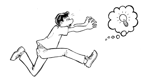
I learned about this essay on creativity and business by Linds Redding from David Malki’s Twitter feed. In it, Redding relates his experience of working in an ad agency pre-Internet. He describes a process that mirrors closely the advice we present here repeatedly. He calls it The Overnight Test. In short, he and his writing partners would perform a massive brain-dump on the topic — throwing every idea… every kernel of an idea… onto paper. Nothing was ruled out. Nothing was judged. And almost everything as posted on the wall by the end of the night. The next mroning, they’d come in and start sorting through the ones that worked and the ones that didn’t. And they would critique one another — respectfully and honestly.
The content you are trying to access is only available to members.
On his site, Scott Kurtz has posted an insightful piece on the nature of Creators’ Rights that might be worth discussing here. It starts as follows:
The content you are trying to access is only available to members.
Well, folks, we’re in November. The election is over, and the holiday advertising season is in full swing. Here are some things that ought to be on your radar.
If you’ve prepped them, now’s the time to start offering them on your site. If you haven’t, you’ve got the weekend and some very good digital printers like NextDayFlyers, OvernightPrints and PSPrint. Get a move on.
Same deal. People are buying their 2013 calendars right now. Now’s the time to start offering yours on your site. And if you can assemble one in the next couple of days, consider using a POD vendor such as Lulu to to make them available quickly.
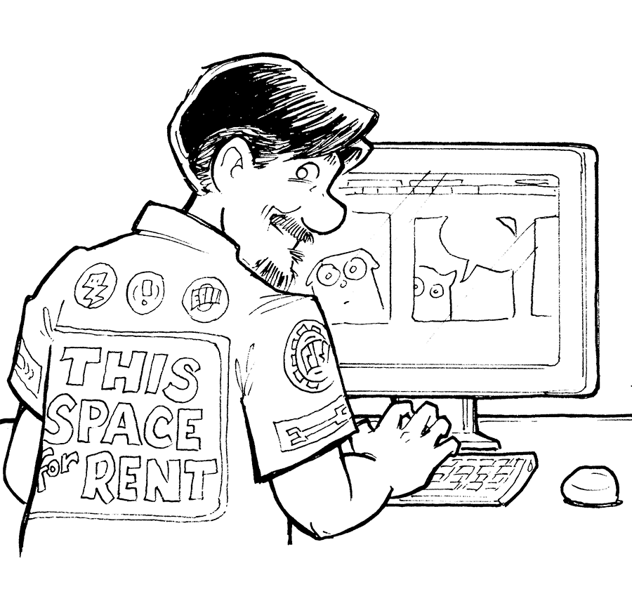
Don’t gorget, the ad space on your Web site is valuable — even if that value isn’t being realized by advertisers right now. If you’re using Project Woinderful, you can make your default image a house ad. And if not, you can always ad some house ads to your Web site manually. Use that space to get your message out if you want your share of the holiday-shopping money that’s going to be spent in the next eight weeks.
If you’re using other ad services — such as Google AdSense, PulsPoint, Tribal Fusion, etc. — remember that those sites use spiders to determine which ads go on which sites (and how often). Your comic is an image — and that’s not spider-able. That means this is a crucial time to make sure your pages have as many words on them as possible to help those little spiders to categorize your site for advertisers. Redoubling your blogging efforts should pay off in increased ad revenue.
The Hitch It / Ditch it critiques have been one of the most popular hot seats on Webcomics.com. You know the drill. I review participating webcartoonists and list one thing I think they’re doing well and one thing I think needs improvement. Then I open up the topic for discussion among the members. Links to the comics being discussed are in the headers.
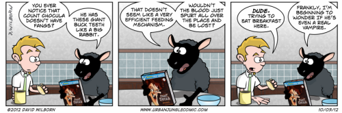
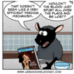
Hitch it: David, please forgive me if I’m wrong, but I have this hazy recollection of giving you a pretty dour review of your joke-writing a while back — Mid-Ohio Comic Con, perhaps? Anyway, I want to give you props. The gag-writing I’m seeing on Urban Jungle is a vast improvement over the last time I checked in with the comic. The Count Chocula comic was a stand-out for me, and so was the electric lawnmower. Some of them need stronger editing. This one, for example, had me thinking that the “we” in the second panel was still referring to “smokers.” And many — like the previous example and this one — need to be pushed further. There are some great concepts that could be really funny if they were developed a little more. But overall? There are some darned funny gags happening in the Urban Jungle.
Ditch it: Speaking of dour critiques, I panned the lack of life in your drawings in a previous Book Cover critique. I’d really like to see you carry those comments over to the way you draw the strip itself. In panel after panel, strip after strip, we’re presented with a cast of characters that stand perfectly straight (arms usually at the sides) with little or no changing facial emotions. Look at the strip I sampled above. That sheep has the exact same expression in panel after panel. Same with the guy.
It’s an office full of animals. I need to see a little more wild.
Hitch it: Working the niche. This comic does an excellent job of identifying its niche (board games) and then focusing its content in that area. There are some truly awesome blog posts about board games that could do a great job of beginning to establish this comic as one of the meeting places for this Community. One question perplexes me though. Howcome the blog is separated from the comic? That seems to defeat the purpose, doesn’t it?
Ditch it: There’s no gentle way to put this. That font? It’s horrible. Everything about it is wrong. The serif face sets a formal tone. It’s hard to read. It’s too small. And the leading is too tight. There… there is nothing good about that font.
Hitch it: Some of the gag-writing in this comic is quite good. This one was particularly clever. So was this one. Keep up the good work.
Ditch it: That Web-site design is not doing you any favors. None of your ads appear “above the fold” and that’s going to hurt your revenue-generating potential. Also, the same old comment about wasted space at the top. Do a site search for “Web Design Hot Seat” and read the results. Most of the stuff we talked about in those threads apply to your site.
On his site yesterday, Scott Kurtz shared a rather interesting thought.
The content you are trying to access is only available to members.
;)