Powered by I will prepare top-down analysis of your comic-based business, including: Art and writing Social media Crowdfunding Marketing/promotion Then...
Today’s show is sponsored by Dreamhost! If you want to own and control your own work, Dreamhost can help you get started.
Patreon’s WordPress plug-in enables you to host Patreon-exclusive content on your website. We’ll talk about how you can use this to grow your membership. Also, we’ll talk about #comicsbrokeme
ON THIS WEEK’S SHOW…
$2 — Early access to episodes
$5 — Submit a question for possible use on the show AND get the exclusive ProTips podcast. Plus $2-tier rewards.
Yesterday, I posted about the importance of adopting the vertical-scroll format for your website and social media. That can be a little extra work. But there’s good news! You now have a new product to offer your readers — a vertical-scroll eComic!
The content you are trying to access is only available to members.
Many artists have conflicted views on using photo reference. The truth is: The judicious, conscientious use of photo reference can be a valid part of the drawing process.
The content you are trying to access is only available to members.
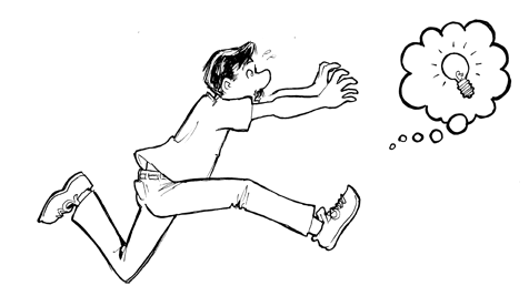
So many of us set a “Success” goal without thinking about this — What happens next? Let’s talk about achieving success — and then the really hard part… maintaining it.
The content you are trying to access is only available to members.
Unnecessary tangents in an illustration can be distracting — and kill the composition in an otherwise great drawing. While sketching a page for his Evil Inc comic, cartoonist Brad Guigar discusses tangents and how to avoid them.
The content you are trying to access is only available to members.
Designing a logo for your comic can be surprisingly daunting. After all, many of us are artists or collaborate directly with artists. But designing a logo requires a slightly different skill set than designing a comic panel. So let’s talk about some DOs and DON’Ts that apply to good logo design.
DON’T use dialogue font
The dialogue font that you’re using for your word balloons is tailor-made for that purpose. It’s not intended to be used as display type — and that’s what you’re looking for in a logo. Beginners make this mistake often — both in logos and in book-cover design. Dialogue fonts don’t work very well in these instances.
DO understand the difference between serif and sans serif typography
Serifs are those little marks that are attached to the main letterform in some fonts — like Times. They’re there to aid readability in large masses of small text. Sans serif fonts, like Helvetica, do not have these little marks. (Sans is French for “without.”)
Serif typography tends to be very formal and a little imposing — especially when used in larger sizes (like a logo). Sans serif is usually more friendly and approachable. Thinking about the emotion you want your logo to convey will help you decide which is better for you.
DON’T work in raster
Your logo needs to be flexible. It needs to be able to be reduced to the size of a postage stamp, and it needs to be able to be enlarged enough to be displayed on the side of a building — and all without a loss in quality. That means you’d be wise to work in vector-based software like Adobe Illustrator. Working in raster-based software (like Photoshop) will limit your re-sizing options.
DO emphasize contrast
Legibility is key to good logo design — and, in type, that means contrast. You may want to avoid gauzy images and blurry effects. And you’ll want your color choices to reinforce the contrast. If you’re unsure, convert the image to black and white (or print it out in grayscale). You should be able to tell immediately where your logo lacks the contrast necessary to be legible.
DON’T botch the kerning
Kerning is a typographic term that refers to the space between letters in a word. If you space the letters too loosely — or too tightly — you can have unintended results. Just ask the folks at Click Lovers…
Good kerning takes years to master. Thin letters — like lowercase l and i — tend to pull surrounding letters closer. Wide letters — like uppercase O and Q — may push surrounding letters away a little.
DO use professional fonts
Part of the joy of using a professionally-designed digital font is that an artisan who breathes typography has already programmed the kerning into the font. So don’t hesitate to purchase and use good fonts to create your logo. And if you want that hand-drawn look, take a digital font you like and trace it.
DON’T forget the border
If your logo will appear on top of a dark background, be sure to put a white border around it to help it from getting lost — or at the very least, prepare a version of your logo that features a white background.
Today’s show is sponsored by Dreamhost! If you want to own and control your own work, Dreamhost can help you get started.
We heard from a listener who took our advice and launched their own website. And now they have only one question: “What the heck am I supposed to DO with it??”