It happens every month. You get to the end of the month and breathe a sigh of relief. You’ve made it through another month, and you’ve earned a certain amount of money on Patreon.
And then, on the first few days of the following month, a significant number of patrons cancel their pledges! Is it the beginning of a long, steady decline?
Probably not. More likely, it’s part of a very normal pattern of patron behavior. So let’s take a closer look at what’s happening…
The Patreon dip
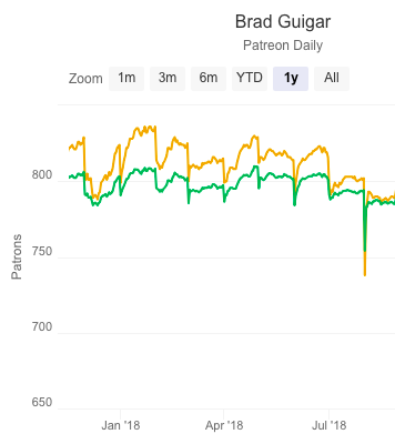
We can see a very typical first-of-the-month Patreon dip in the chart to the right. Some are smaller than others, but they all occur on the first day(s) of each month.
We discussed the Patreon dip in this September 20, 2018, episode of ComicLab (08:36) — linked below.
False assumptions
First of all, this is a good opportunity to address a wider false assumption many creators have in regards to their Patreon campaigns — a pledge is newer assumed to be ongoing. You can never assume a commitment of more than one month from any given pledge.
This is an especially important point to understand if some of your Patreon rewards are meant to be given after a number of consecutive pledges. In other words, offering a reward after a patron has been pledging for a year isn’t a very good idea. Your patron may not be intending to pledge that long.
In fact, you should be approaching Patreon with a completely different mindset. You should be asking yourself — every month — if you’re doing enough to keep those patrons for one more month!
Ongoing pledges? Ongoing rewards!
In other words, if you want ongoing pledges, you have to be willing to post ongoing content and ongoing rewards. Exclusive content posted regularly, for example, will keep those patrons in place for another month. They’re going to want to see what’s next. Moreover — they’re going to feel as if they’re getting their money’s worth for this month’s pledge!
Rewards, too, should be ongoing. By that, I mean, reward should be monthly. Regular reinforcement for a regular pledge. Rewards that take several months’ pledges to earn should be reserved for high-value items. For example, I offer original art in return for three consecutive $20 pledges. That’s because offering originals as a reward for a single $60/month pledge is too great a commitment on the part of the patron. (Not to mention me… that’s a lot of physical shipping!)
But in general, if you want a monthly patron, you’d better be prepared to offer a monthly reward.
End-of-the-month fluctuations
Part of the dip you see at the first of every month is actually due to the closing days of the preceding month. If you check you Patreon numbers of the first of the month, you’ll see wild fluctuations throughout the day. This can be very stressful — until you understand the mechanics behind it.
You see, as Patreon processes your backers’ credit/debit cards, some of those charges are being declined. This happens for a wide range of reasons, but the most frequent is simply that the card that the use enter has expired. They need to go in and manually update their information. And until they do that, they will be removed from your Patreon totals (both poledges and patron count).
Don’t delete declined pledges!
Don’t make the same mistake I made with patrons with declined pledges: I deleted them.
A little later, my contact at Patreon got in touch to see how things were going, and I brought the issue up with her. Her response was that Patreon has made it so any patron who has a declined pledge will not be able to access members-only content. So as soon as their card is declined, their access to protected content is disabled. And that remains the case until they update their payment information. Once they successfully do that, they regain their access — and Patreon attempts to recover any pending charges from the past.
So, deleting those patrons — especially the ones whose payments had cleared in the past — was a big mistake that may have cost me hundreds of dollars over time.
Bottom line: Don’t delete a patron whose payment has been declined. His or her access is blocked, and if you delete them, you’ll never have the opportunity to reclaim that lost money.
From Patreon:
Will Declined Patrons Still Get Access To My Content?
Not any longer! We’ve listened to your feedback and have been taking steps to protect your content from patrons whose pledges decline.
If one of your patron’s payment declines, they will stop receiving email notifications about your new posts until their payment goes through. Additionally, if they try to view content while logged into Patreon, they will instead see a page reminding them to update their payment method.
As soon as their payment method goes through, they’ll be able to view your posts as well as receive email notifications about them.
The power of exclusive content
This is yet another reason that I remain enthusiastic about posting exclusive content. When patrons with declined cards attempt to access that content, they will be redirected to their payment page, where they can update their information. That money is charged immediately (whether you use Charge Upfront or not), and the patron regains access immediately.
That’s one of the reasons I like to make several posts at the beginning of the month. I like to provide as many opportunities for this interaction as possible.
The bottom line
The bottom line is this: A first-of-the-month dip in your Patreon campaign is normal and natural. Don’t panic. Realize this for what it is — a recognizable pattern of behavior — and plan your crowdfunding approach accordingly.
