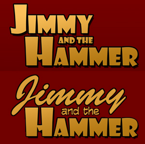
Logo Hot Seat, Part Three: Typography
In the first Logo Hot Seat, we discussed some flaws that fall under the heading of an important element of design: Legibility. In the next Hot Seat, we talked about using Negative Space to improve your logo. In this next group of logos, I’d … Continue reading Logo Hot Seat, Part Three: Typography
36 Comments
